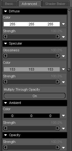
The different bits of the surface tab.
Since DS3 the surface tab has 3 different tabs.
Basic (
Not enough settings can be changed here.)
Advanced (What we are going to work in,)
Shader baker (An advanced feature that shows up in DS3A which we are
going to ignore.)
With my set up the surface tab is already on screen docked to the right of the screen. If yours is not showing their go to View then select Tabs and finally click on Surfaces, now depending on how your DS is set up it may dock over to the right or be free floating in the preview area. If it is floating I would advise grabbing the top of the surfaces window and dragging to the area on the right to dock it there it makes life a lot easer to have it there but that is a personal choice.
Now all the work we are going to do is in the advanced tab. So parts of that tab are:
Diffuse (or main texture)
The first section is Diffuse. This is where we add a texture or a colour to the surface of the model. We can change the strength of how the texture map is applied to give a slightly different effect. You can also apply a second texture in the strength channel which will add say a tattoo to the texture. The general mapping of this second texture needs to be the same as the first and any part of the texture that you do not want shown needs to be white. The problem with this is the second texture does not show in the preview window and can only be seen when the scene is rendered. (There are plugins that aid with this that work a lot better).
Specular (Or highlight)
The next bit is the specular channel. This is the main channel that helps give a texture a nice shiny look or a soft sheen depending on how you set it up. This is one of the main problem areas when using Poser settings as nothing comes across properly and this section will need a lot of work to make the texture look nice.
The first bit to look at is:
Glossiness. This controls how the highlight is spread. The higher the number, the less it is spread out.
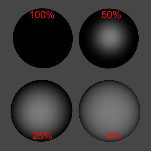
As you can see at 100% you can’t really see the highlight and at 0% it basically all highlight.
The next is colour. You can change the colour of a highlight. This can affect how the texture looks.
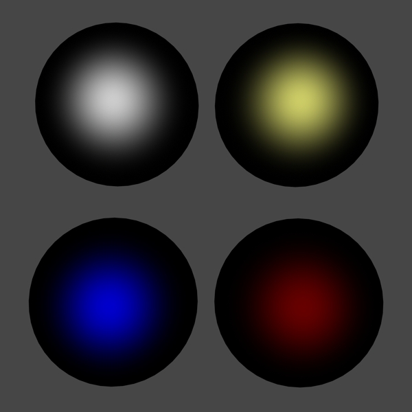
As you can see when applied at 50% Glossiness, different colours show up differently and can affect the look of the texture. I tend to use a light grey or lighter colour of the texture I am using so as to not affect the texture colour too much. I only use white when after a high shine effect like on plastic or shiny metal.
And then we have strength. This controls how much highlight is added.
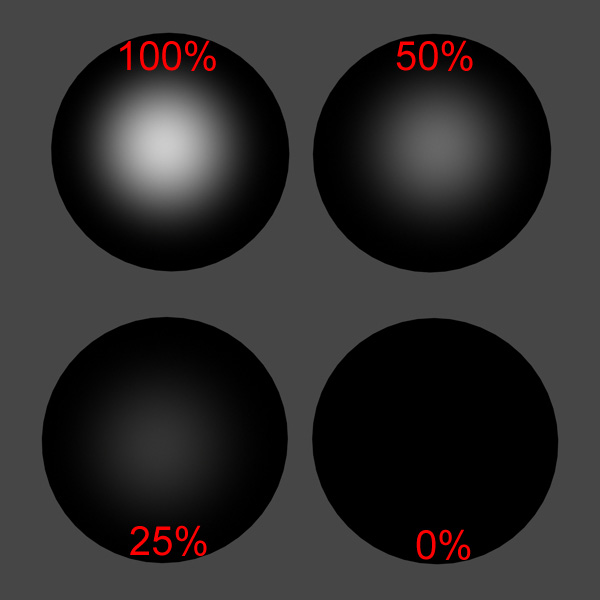
As you can see the higher the strength the more highlight there is.
Now to help control the amount of highlight or specular some texture creators create what is known as a specular map. This is a grey scale image with the darker areas meaning less highlight than the lighter areas.
This does not load at all when loading a Poser map so you have to go looking for them yourself. The normal naming conventions mean they end with a s or spec i.e. head-tex-s.jpg or head-tex-spec.jpg. When we get to adjusting the settings I will explain how I tend to find them.
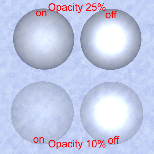
Multiply through opacity
This is a simple on or off switch and only really comes in to play when you start making objects transparent using the opacity settings. When it is on the highlight is affected by the opacity settings so it’s just as transparent as the object, when it is set to off the highlight is not affected by the opacity settings and the object is more transparent than the highlight. Handy for when creating glass-like objects or that little twinkle in the eye.
Ambient (or glow)
The ambient channel can help give a nice soft glow or make something really light up in the dark
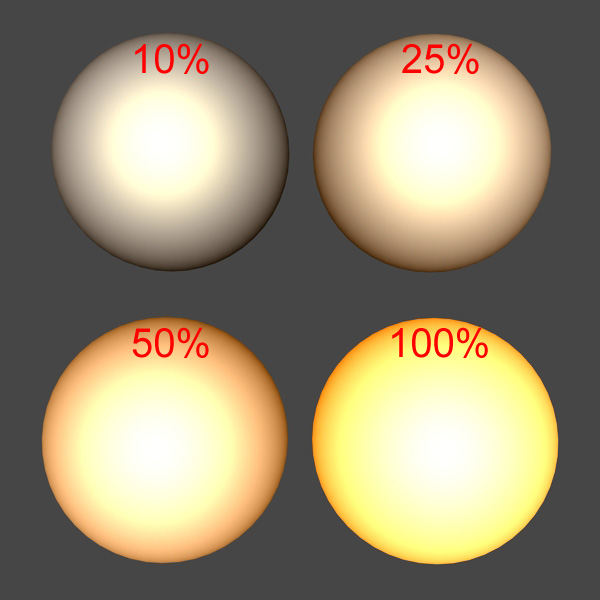
Now it can depend on colour but here is a white ball with a light yellow highlight (at 50%) with orange ambient at different strengths. Mixed in the diffuse settings you can get some nice effects but can take a lot of playing around and will depend on your lighting as well. Again a grey scale texture can be used to control where it glows and where it does not but this is a DS thing so if a texture has an ambient map it will normally come with DS settings anyway. (glow effects are done with nodes with Poser and do not come across at all and have to be created differently in DS) most of the time you will find the ambient channel set to black (0-0-0) this works the same as having no ambient.
An ambient map similar to how the specular map works can be added to the strength section to control what part of the surface glows and what part does not.
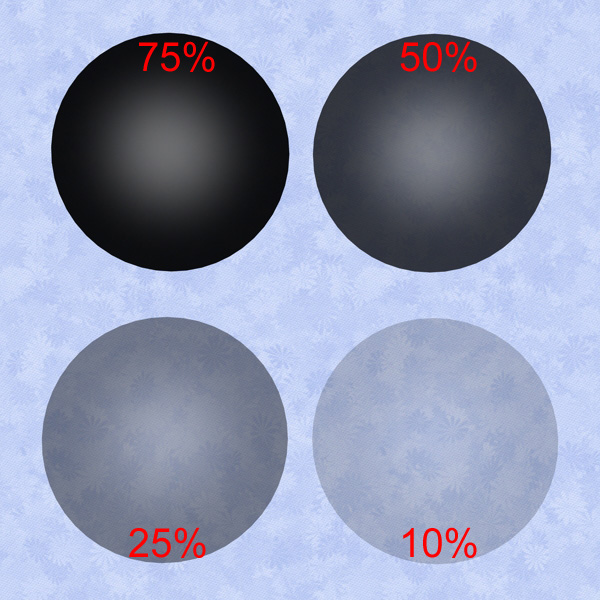
Opacity
Opacity changes how transparent an object is. So if we adjust the strength setting we get:
A lot of the time with clothing items a lot of texture creators may use transparency maps (known as trans maps) to cut out bits of the texture to make an outfit look different. These are grey scale with the lighter the area the less transparent it is. So white is not transparent at all and black is totally transparent. Most of the time these settings come through ok but every now and then a trans map will be set at 0% instead of 100% which in DS means the object is totally see through as in DS the strength setting does not work with the trans maps as it does in Poser. So sometimes poser trans maps do not work that well in DS as in Poser you can apply a trans map at say 10% but in DS it applies the trans map then applies the 10% opacity on top so the object is 90% transparent as well as the trans map.
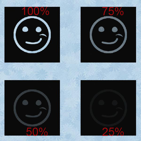
What I mean is if we take a simple trans map:
![]()
and apply it to a plane and adjust the strength we get:
![]()
So the strength ignores the trans map and just applies it's settings to the whole surface.
But in Poser the strength option would apply to the trans map and only apply it at the percentage. Which means at 100% you would see no difference but at 25% the smiley face would not be as transparent. It would be as transparent as surface area in the 75% example.
See the difference in this Poser version:
Most of the time it does not make much difference but some times you will need to take a trans map into a image editor program and make it lighter or darker to work nicely in DS these textures normally end with a –T or –Trans.
So if a surface texture is not showing up, or looks transparent. Look to see if it has a trans map applied and set to 0. If it has just remove the trans map from that surface as it is not needed, and remember to set the strength back to 100%.
Bump mapping Displacement mapping and Normal mapping
Now these next three bits alter how the surface of an object looks with or without a texture but is normally used with a texture to give it a bit of depth.
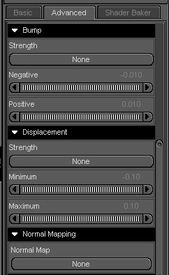
Bump mapping
Bump mapping is a computer graphics technique to make a rendered surface look more realistic by modelling the interaction of a bumpy surface texture with lights in the environment. Bump mapping does this by changing the brightness of the pixels on the surface in response to a height-map that is specified for each surface. Now rather than get in to loads of details on how this works here is a link to Wikipedia page with more information on bump mapping http://en.wikipedia.org/wiki/Bump_mapping .
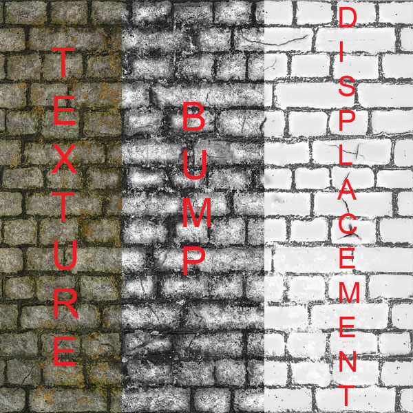
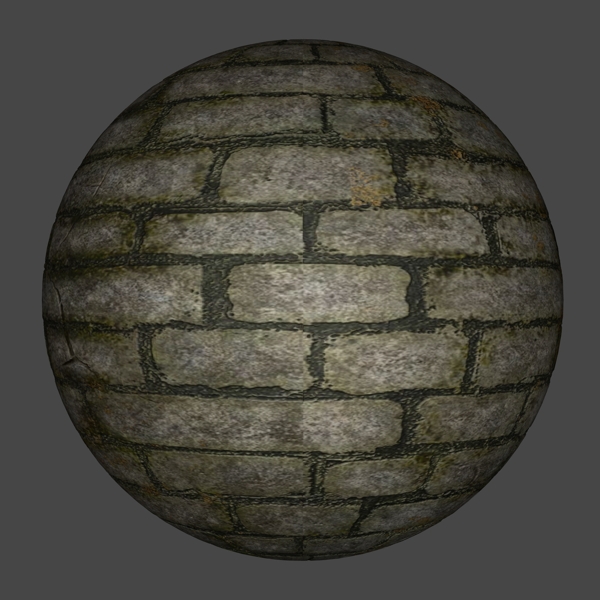
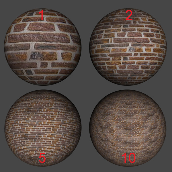
So what does this look like? So if we take a brick pattern taken from Dark Designs - Volume 2 available at the Daz store,
shown here with the texture bump and displacement:
Now when we add this texture to a sphere in DS we get:
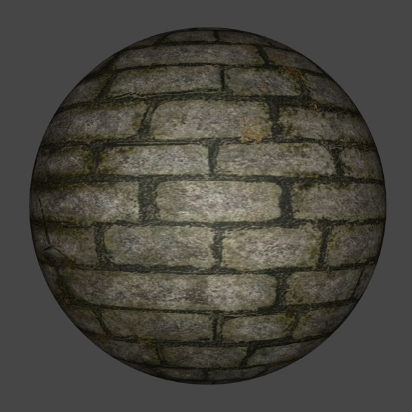
Then we add the bump:
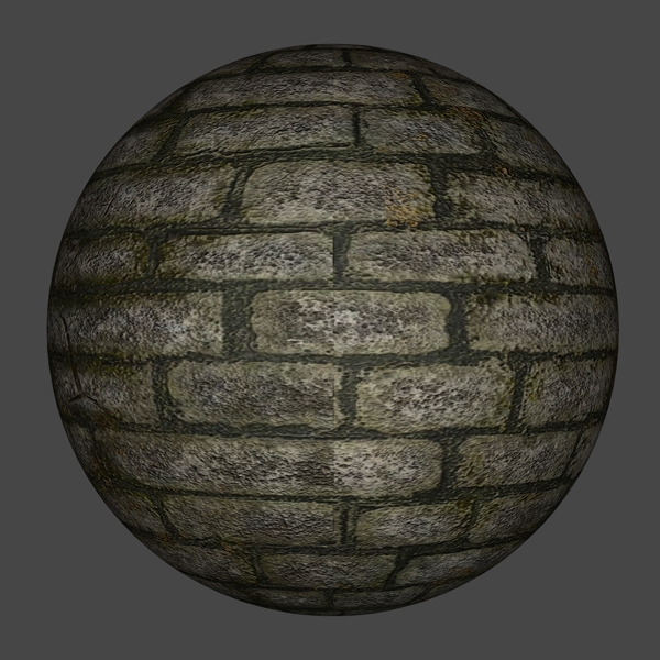
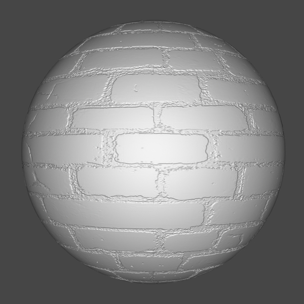
Now let’s remove the texture leaving only the
bump map:
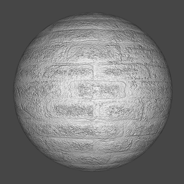
And we can see the bump mapping.
This is an area that does not come across very well from poser settings and will need a lot of adjustment to make it look right for example if doing a close up of the face you will only want to use a small amount of bump and items further away from the camera will need stronger settings.
Displacement maps
Displacement mapping is an alternative computer graphics technique in contrast to bump mapping, normal mapping, using a (procedural-) texture- or height-map to cause an effect where the actual geometric position of points over the textured surface are displaced, often along the local surface normal, according to the value the texture function evaluates to at each point on the surface. It gives surfaces a great sense of depth and detail, permitting in particular self-occlusion, self-shadowing and silhouettes; for more information on this here is the link to the Wikipedia page http://en.wikipedia.org/wiki/Displacement_mapping
Displacement maps are handled differently in Poser and DS.
If you have an item optimized for Poser, you should be aware of how to tell, and
how to adjust your shaders to accommodate this.
Poser starts the displacement map at black and anything lighter raises it. It
only raises the surface, never lowers. All the edges and outside of the map
areas on the image should be 100% black However, in DS it starts at 50% gray and
both raises and lowers the surface. All the edges and outside of the map areas
on the image should be 50% black (gray) and the map can contain both lighter and
darker areas.
This means that any displacement map made for Poser (starting at black) will
seem weak in DS and should be compensated for. Likewise, any displacement map
for DS will puff up the mesh in Poser, causing exploded seams and overall
mushiness.
What many content creators do nowadays to support both is make the map for DS,
and use math tricks in Poser to make it work there as well. So rather than make
2 image maps, they make a material setting for each program.
So how does this look at this point? I will take the displacement map from the above set and add it to the displacement map channel just to show an example as it’s not easy to create a displacement map but this is a good one as designed for poser but works well in DS .
And with the texture
And if we add the bump map back:
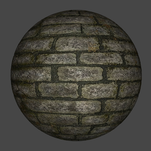
It needs work but hopefully you get the idea.
Now if the settings you would use will fully depend on the effect you are after and the distance away from the item if you are close up will need less strong settings than something in the distance also certain types of lights and or shaders can affect how the displacement looks. If you want some more information on the different colour settings look at: http://forum.daz3d.com/viewtopic.php?t=44578&postdays=0&postorder=asc&start=0 it also explains the differences between Poser displacement maps and DS ones.
Now if you are using Poser mats no displacement settings will show up at all in DS as in poser all displacement settings are done in nodes so you will need to set these up yourself. Displacement maps normally end with a –d or a –disp.
Normal mapping
Now this is a new feature added in DS3 and as such I will class it as an advanced feature and ignore it as at the moment it is not widely used. Here is what Wikipedia has to say on it
In 3D computer graphics, normal mapping, or "Dot3 bump mapping", is a technique used for faking the lighting of bumps and dents. It is used to add details without using more polygons. A normal map is usually an RGB image that corresponds to the X, Y, and Z coordinates of a surface normal from a more detailed version of the object. A common use of this technique is to greatly enhance the appearance and details of a low polygon model by generating a normal map from a high polygon model. And the link to more info is: http://en.wikipedia.org/wiki/Normal_mapping
Reflection and Refraction
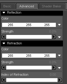
Now reflections do just what it says. They reflect other surfaces. For them to work in DS you need to have something to reflect and most people recommend a 360 degree environment that way you can make sure to get a nice reflection. A few premade sets now come with sky domes to cover the whole scene so that you can get a reflection. And a lot of the time items shown in the reflection will be off screen (behind the camera) I tend not to bother that much with real (known as ray traced) reflections as they can take a lot of time to work out and can put a strain on your system while rendering them causing very long render times.
For example:
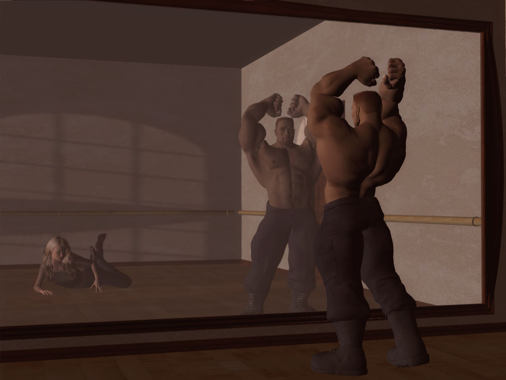
This image I created a while ago. The main figure is standing in front of the mirrored wall but you can still see the rest of the room including the female figure on the floor and the shadows created by a light from a window that you can’t see in the image. Now if you are doing a scene with a mirror or shiny floor you will need to use ray traced reflections as you need the reflections to mirror the scene. But if you are just doing shiny metal, painted metal or plastics say on a car you do not need it to mirror the scene a lot of the time you can get away with what is called a shadow map which is a pre rendered image that is added to the reflection channel to simulate a reflection.
As shown here applied at different strengths on the black spheres:
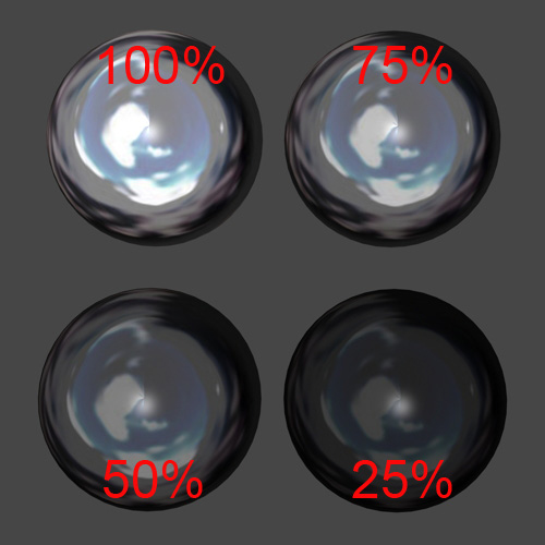
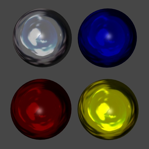
With a nice reflection map plastic and painted or unpainted metal can look very good without slowing down render time like ray traced reflections can. Now these settings come over from Poser but like most settings will need adjusting to make look nicer. Now you can change the colour of a reflection and reflection map by adding it in the colour section and it will change the look of the reflection as well as change the colour of a surface. Handy if you have say a silver item that you wish to make look gold. The image below each sphere has the same settings and reflection map just a different colour in the reflection. Also if you remember our talk about specular maps you can use one of them here or something similar in the strength channel to help control what is reflective and what is not say for a shiny logo on a tee-shirt.
Refraction
The Wikipedia says: Refraction is the change in direction of a wave due to a change in its speed. This is most commonly observed when a wave passes from one medium to another at an angle. Refraction of light is the most commonly observed phenomenon, but any type of wave can refract when it interacts with a medium, for example when sound waves pass from one medium into another or when water waves move into water of a different depth. See http://en.wikipedia.org/wiki/Refraction for more information on that. So what it does is help us make a surface look more like real glass or water
So adding it to a surface set up to look like glass gives you something like:
Even this simple scene took over 35 min to render and that’s without shadows and only two simple lights.
Another place for good information is this Daz3d Forum thread http://forum.daz3d.com/viewtopic.php?t=18868
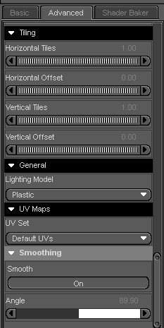
Tiling, Lighting model, UV Maps, smoothing,
Now we are down to the last areas
Tiling
This is a new feature to DS3. Before, you needed to purchase a shader plugin to get this option, and it does what it says. It allows you to tile a texture on the surface of your model. Useful say if your brick work looks to big. For this to work you will need what is called a tileable or seamless texture otherwise you will see where the texture stops and starts again. You can also offset the texture by moving it up/down left or right. Useful if you have a logo in the centre of your texture that then shows in the wrong place so you can adjust the position.
Default settings are 1 which means one copy of the texture is on the surface.
Here is an example of different settings
Lighting model
Now this next section is quite important to making surfaces look nice in DS. It has 6 different options to help make surfaces look nice
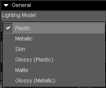
Now the default option is always plastic. With most settings that come over from Poser they are not set up correctly and they don't look good. they blame this option and turn it to matte which then turns of gloss and highlight and reflections which can give a very dull surface this handy when you want that but not so good if you are trying to do a skin surface.
Now if we use the basic four (Plastic, Metallic, Skin, Matte) on spheres with every other setting the same we get
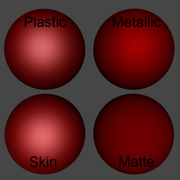
The plastic and the skin does not look that different as shown here but the skin option can add a slight pink to the surface colour which is useful at times but as shown can still make skin look quite shiny if you don’t have all your settings worked out. Now if we add a reflection map to the spheres we get:
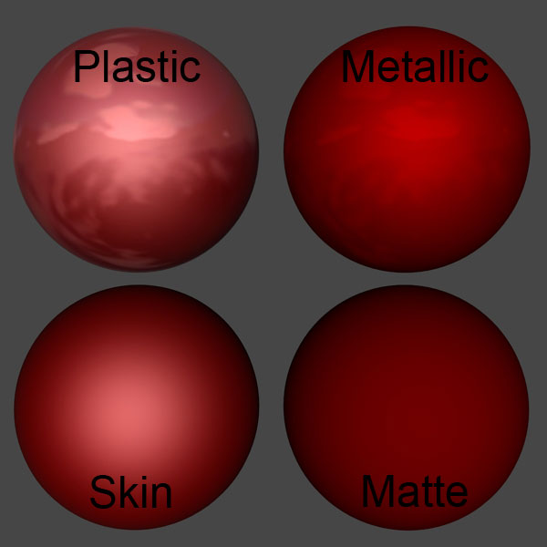
As you can see the plastic and metallic versions show the reflection map. there is no real change to the skin option and nothing will change the matte option it will just show the diffuse colour or texture.
Now I had left two options out so far the Glossy (plastic) and Glossy (metallic) so if we add them the difference is:
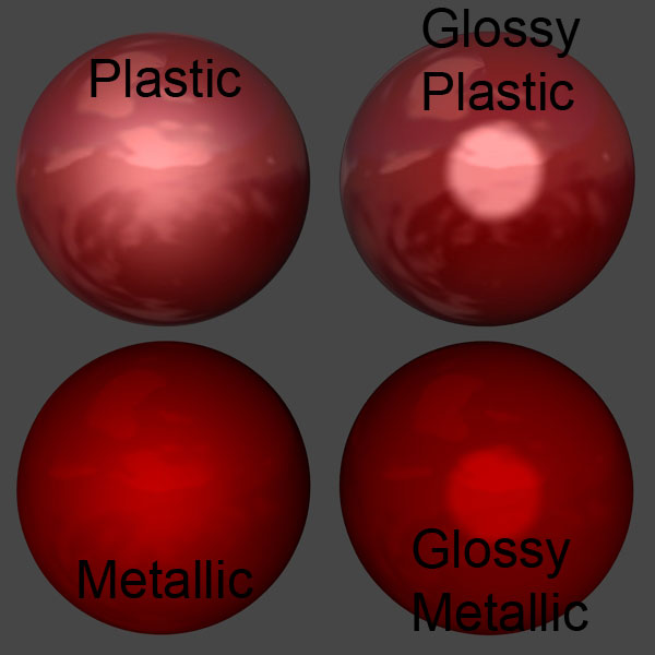
So you will need to work out the type of lighting model that works best for you.
UV Maps.
This is another one of those advanced features that I am not going to spend any time on. It is an option to help you add a different UV map to the surface of your model you will need to understand UV mapping (this is what Wikipedi says on the subject http://en.wikipedia.org/wiki/UV_mapping ), and have an application that is able to create UV Maps. So far the only time I have see this used was to allow people to us the V4 UV Mapping on M4 as the UV mapping is slightly different on both figures but the mesh surface is roughly the same size.
Smoothing
Another newer option to DS3 again quite an advanced option and it is an option that will be more used by model creators. It helps smooth the edges and corners of a model making them look nicer Poser has this built in as well so this was added to help models look as nice in DS as they do in poser before you add textures. Again it is best to leave this alone unless you are having problems with a model looking too or not smooth enough then you just adjust the setting up or down until you get a result you are happy with.