BASIC CRT MONITOR SETUP
MONITOR WHITE POINT / BLACK POINT
RIGHT: If all steps are distinguishable from one another

TOO LIGHT: Light steps merged

TOO DARK: Dark steps merged

QUICK SETTING OF BLACK POINT USING THE MONITOR BRIGHTNESS CONTROL
Your normal workroom lighting is desirable for this operation. Remove any wallpaper from the Desktop and set the background colour to black. Resize the screen so that there is an unscanned black border surrounding the desktop
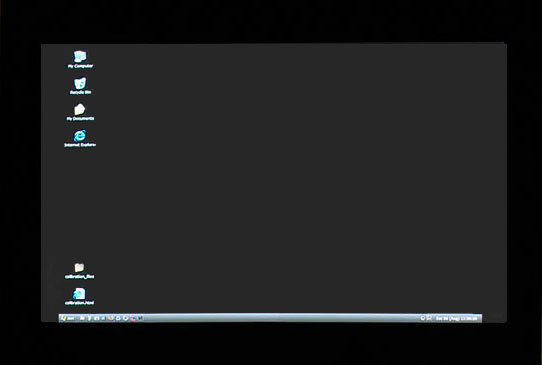
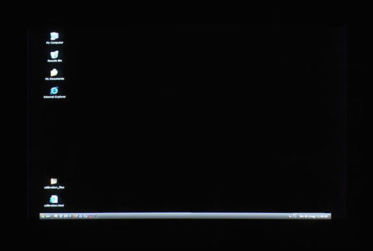
With contrast and brightness at maximum, reduce the brightness to the point where the desktop just merges with the surrounding unscanned black border. Note the position and resize your desktop to normal size.
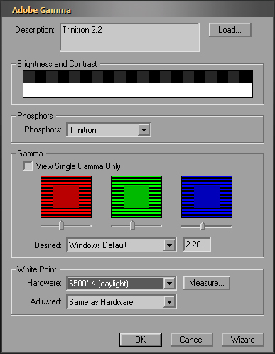
SETTING GAMMA (with Adobe Gamma)
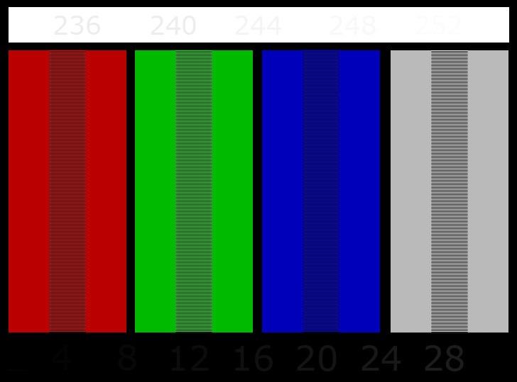
For setting colour by eye - I find it very useful to have a bigger target patch (below) - and a darkish grey background as it easily shows colour casts. Always check black point/white point brightness first. Fine tune the patches by selecting each colour channel and use the left/right arrow keys on the keyboard rather than the sliders.
2.2 GAMMA PATCH (CRT MONITOR):
1 If the black point is set correctly, 8 should be just visible. (4 will be distiguishable from true black only on very high quality (and expensive) monitors. On the average monitor, the visibility of 4 usually means that the brightness is slightly too high)
2 If the white point brightness is not set too high, 252 should be just visible. (May require a slight lowering of contrast)
3 All four patches should be uniformly smooth when viewed from 3 to 4 feet.
4 The background and the grey patch should be NEUTRAL grey.
GETTING A CLOSE MATCH OF PRINT OUTPUT AND YOUR MONITOR
This method has served me well with an EPSON 2100 using EPSON Archival Matte Paper:
1 Aquire a standard printer test image file containing a wide variety of colours and tones (see Norman Koren, Getty Images and print it unaltered in any way - as follows:
2 Calibrate your monitor - as above
3 Printing: Use the image profile of the test image (Adobe RGB, sRGB etc).
4 In the printer profile tab -use the paper profile (in this case, epson archival matte). black point compensation checked. Rendering intent: Perceptual or Relative Colourmetric.
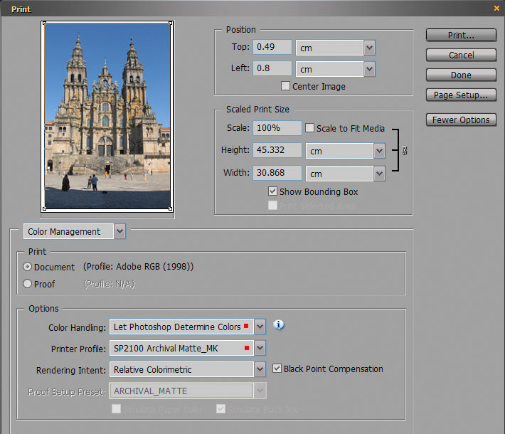
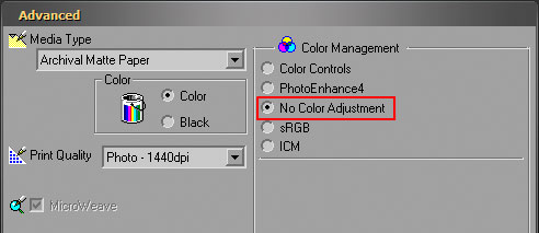
5 To avoid applying colour management on top of your selected colour management:-
Make sure that
NO COLOUR ADJUSTMENT
is selected in the printer colour management tab. (crucial step)
The previous steps will suffice for an initial printer/monitor setup but there will be an inevitable difference between the printed image and the screen image. In general, it may look flatter and with some -or all colours - less saturated. Correcting this to an acceptable level is done by SOFT PROOFING in an image editor. With soft proofing you can see a simulation of the shift in certain colours and brightness transferring to your preferred paper - before you print - and are able to make the necessary adjustments to the print file.
SOFT PROOFING IN PHOTOSHOP
Select View > Proof Setup > Custom and scroll down to select your paper profile.
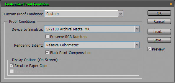
Make a duplicate image which is kept in view. Press CTRL+Y to apply the softproof filter which will simulate the shift in brightness and colour. This is then tweaked with to more closely match the unfiltered duplicate.
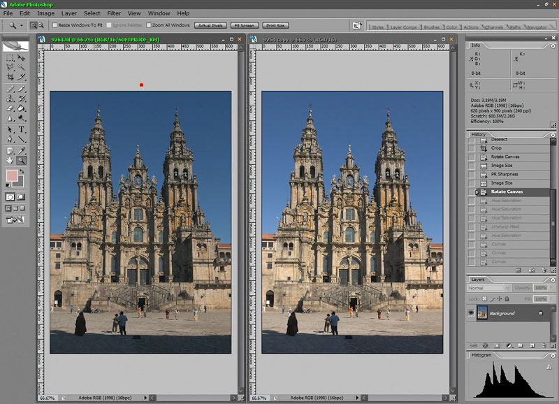
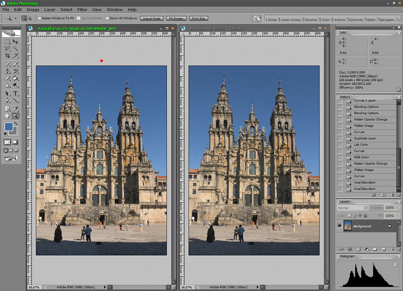
The resulting image should then print acceptably close to what you see on screen.
ALL of the preceding is absolutely dependent on first arriving at an accurate monitor profile which has a smooth range of greys from black to white and .... NO COLOUR CASTS. Keep an eye on your greys. If there is a hint of any other colour besides neutral grey - calibrate your monitor until the greys are neutral.
Photography