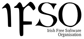
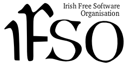
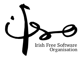
Proposed Logos for the
IFSO
23rd February, 2004
Here are a few ideas for a simple black-and-white logo for the
Irish Free Software Organisation.
Why no gnu?
I mentioned the issue of a logo privately to Ciaran O'Riordan
after seeing his proposed 'gnu
playing a harp' on the fsfe-ie mailing-list, and since then I
read up all mentions of it on the list archive. It seems no-one but
Ciaran came up with any other suggestions, and several IFSO members
liked the Gnu and harp combination.
While I like the gnu as a logo for the FSF and the GNU Project (it's
charming and playful), I can see many reasons not to use a gnu for
our logo.
- Most Irish people won't recognize the gnu at all, let alone in
its connection with Free Software, so it has no immediate
symbolic power.
- Much as we are all indebted to GNU, we are promoting more than
just the GNU Project. To reflect a broader approach to Free
Software: Apache, the Linux kernel, the free BSDs and so on, a
less specific logo would be more appropriate. FSF Europe, for example,
despite its very close ties with FSF & GNU has a very simple,
modern, initial-based logo.
- In modern Ireland especially, appearance is everything. I'm
afraid a letter to a Minister with a 'gnu and harp' logo is going
to get chucked in the bin. IFSO is largely a political pressure
group; to reflect this, the logo should be simple, serious and
professional-looking.
Other Ideas
I know these logos seem a little plain. I had played about with
adding some graphics but nothing quite seemed to work as well as
the plain initials. The first idea I had was to include some simple
Celtic knot-work on the Celtic Font logo (where the full
organisation name is now), possibly including the head of a bird
pointing out to the right. A bird is a very popular symbol for
freedom, the AFFS uses one on
their logo. Next I thought, maybe a swan in flight, as in the
Children of Lir (although in fact, being swans represented
imprisonment for the children, rather than freedom). Anyway, I came
up with a nice silhouette shape, but it didn't fit well with either
the Celtic Font or the Brush-Drawn lettering, and it seemed to mean
too little by itself. (Perhaps it might yet work as a
very-pale-tinted background to the Brush-Drawn logo.)
If you have an further suggestions for logos, or suggested
modifications for the ones here, feel free to e-mail me:
cathalmcginley at eircom dot net
How the logos were produced
I used SANE to scan a page of
Celtic type for the first two logos, and my brother's brush-sketch
for the third. The scanned images were cleaned up, scaled to size
and blurred slightly with the GIMP. I used potrace to convert the
bitmap images into SVG. The rest of the work was done with Sodipodi. The images used on
this page were grabbed from Sodipodi by the simple expedient of
using KSnapshot when they were at
a scale I liked. The smaller versions of the logo, without the full
organisation name, were produced using GIMP.
You can mess about with the SVG
images in Sodipodi if you like. They're GPL'd, (and why
not?). Please send me any interesting variations.
Verbatim copying and distribution of this entire
article is permitted in any medium, provided this notice is
preserved.
Copyright © Cathal Mc Ginley 2004


