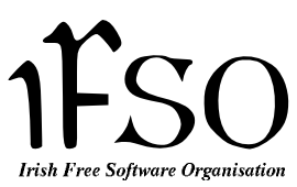
Proposed Logo for the
IFSO
13th March, 2004
| Celtic Font 2 Revised |

|
Based upon Celtic Font 2,
incorporating suggested improvements from the mailing list.
The 'I' has been pulled down slightly and the 'O' pulled up to
make it level with the other letters. The 'F' and 'S' have been
separated to reduce the crowded look.
|

|
The modifications were made with GIMP. You can mess about with the
XCF image if you like. I don't
have a great selection of fonts on my system, so you might like to try
other fonts for the organisation name part.
Verbatim copying and distribution of this entire
article is permitted in any medium, provided this notice is
preserved.
Copyright © Cathal Mc Ginley 2004

