Page created 18 January 2004
EDWARD LAW
ARMS, CRESTS & MONOGRAMS
UK HOTELS - PROVINCIAL
Victorian collections of crests almost invariably contain examples of hotels, either well-known London concerns or lesser known provincial establishments.
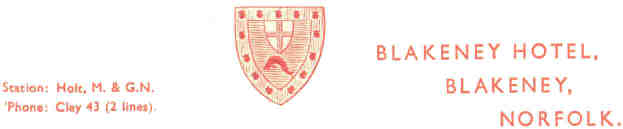
The letterheading above recalls a past age
when proximity to a railway station was a matter of some
importance, with personal transport restricted to the wealthy.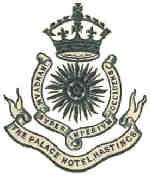
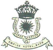
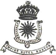
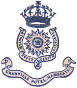
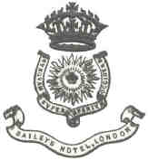
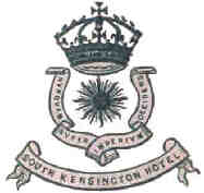
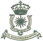
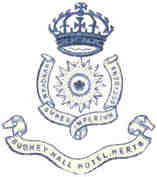
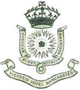
This group of crests, with uniform design, and the same Latin motto "nunquam super imperium occidens" indicate that hotel groups are not a modern phenomenon. Two of the crests displayed are for London hotels, the remainder are from a variety of resorts both seaside and inland.
 |
 |
 |
 |
 |
 |
 |
 |
 Most hotel names
were chosen to convey an impression of substance and solid
British values, often with royal or noble connotations:
Alexandra; Burlington; Clarendon; Crown; Empire; Grand; Imperial;
Majestic; Palace; Prince of Wales;
Most hotel names
were chosen to convey an impression of substance and solid
British values, often with royal or noble connotations:
Alexandra; Burlington; Clarendon; Crown; Empire; Grand; Imperial;
Majestic; Palace; Prince of Wales;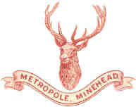 Queens; Rutland; Victoria.
A large number were called or had the prefix, Royal.
Metropole, a very common name, perhaps had a
significance which is no longer apparent. The crest of a deer's
head on the Metropole, Minehead, whilst beautifully executed has
no obvious relevance.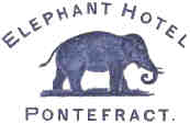
Along with
the worthy names were a few quirky ones, perhaps successors to
inns, where there was a long tradition of unusual 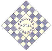 names.
As with so many nineteenth crests the collector is led into aspects of social history.
 How did the
Elephant Hotel in Pontefract, Yorkshire come by its name? Any
connection to their exotic liquorice cakes?
How did the
Elephant Hotel in Pontefract, Yorkshire come by its name? Any
connection to their exotic liquorice cakes?
Or the Chequers, at Uxbridge, near London, with its sign of a chess or draughts board?
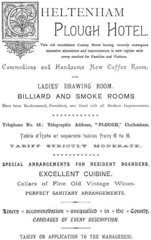
The Plough Hotel at Cheltenham sounds very much a rural establishment, but their advertisement in Burke's Peerage of 1893 indicates a high class hotel.
The list of facilities gives an insight into the requirements of the age: the ladies drawing room, separate smoke rooms, telephone, and "perfect sanitary arrangements".
Some requirements, of course, never changed, the billiard room and the cellar of fine wines.
Their crest was limited to the name of the establishment.
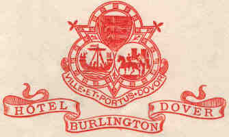
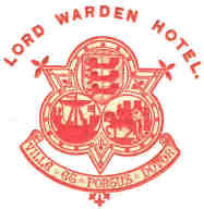
The crests for the two Dover hotels are bold and attractive, and were clearly produced or designed by the same hand.
 |
 |
 |
Return to HOME or to TOPICS PAGE |
 |